


The other day I was sent a link to a post by elledecor.com entitled ‘25 Black & White interiors that prove less is more’ - Simple, chic, and guaranteed to never go out of style.
I clicked on the link out of curiosity and started scrolling through. As I marveled at these beautiful spaces I got thinking about the expression used in the title ‘less is more’.
Is less really more?
It is an ambiguous saying and I know many that would argue otherwise to the proverb. The dictum is often overloaded with meaning beyond its worth. It is a counsel, nothing more.
But like many things the nature of its meaning will depend on the zeitgeist, nature and context of its utility, expression or mediation.
Such as with Pablo Picasso’s (1943) ‘Bull's Head’ (seen below), to many this piece out of context is simply a sprung saddle (Brooks b33 for preference) attached to some touring style handlebars that have been rotated upside-down to make the combined article appear as a bulls head. Whilst with context and in the realms of minimalism the phrase ‘less is more’ is often uttered as the significance of this piece stems further than first meets the eye.
_-_Bulls_Head.jpg)
Pablo Picasso’s (1943) ‘Bull's Head’ - Image source: http://ow.ly/4mYyAy
So yes! Less is more if there is a well-defined context that the viewers or audience are alert to.
But this said the minimal more easily enters the world of the iconic because there are no unnecessary details. As with this piece, the complete reduction in the unnecessary and carefully considered use of materials perfectly expresses two dynamics. Firstly that it is constituted of two mundane inanimate objects, a leather covered bike saddle & handle bar; and secondly that the juxtaposition resembles a bulls head. In turn irrespective of who you are; through both our innate humanistic need to understand and the pieces simplicity and abstinence from distraction, you are forced to draw context, interpret and derive meaning through looking further at fabric and analyzing the details of its few constituent parts.
Therefore whilst there are potentially boundless interpretations of this piece to be made, ultimately the power of this piece is its ability to communicate so much through such a limited (yet considered) pallet.
A very short story from Richard Brautigan:
"It’s very hard to live in a studio apartment in San Jose with a man who’s learning to play the violin.” That’s what she told the police when she handed them the empty revolver. (From Revenge of the Lawn: Stories 1962-1970)
Not a word is wasted and each sentence resonates. It is a stunningly brilliant vignette in two sentences. It is pared down to the absolute minimum and as such it is darkly funny.
The antidote is less can be more (certainly in the creative realms) but requires careful consideration as its utility, expression or mediation and context will alter its nature, meaning and experiential outcome.
And this certainly lies true too in the realms of architecture and interior design. As with Pablo Picassos Bulls Head and Richard Brautigan excerpt, Elle Decors examples of tasteful minimalist monochrome interiors succeed through their ‘simplicity’. Expressing similar characteristics in both their reduction in the unnecessary and considered use of materials, mediums and colour.
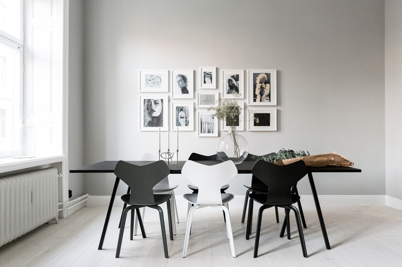
'Fashion Squad': Carolina Engman - http://ow.ly/4mYzRK
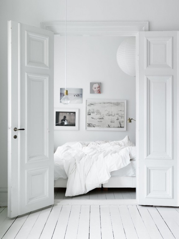
'Fashion Squad': Sharyn Cairns (FOR INSIDE OUT) - http://ow.ly/4mYAg8
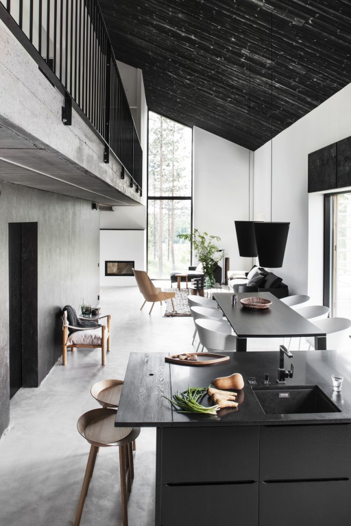
'Daily Dream Decor' - http://ow.ly/4mYAv7
Finally, a last quick example of how less is more, Brigid Reilly has a minimalist palette of black and the absence of black, white. So what more do you need? With that severely restricted palette she has generated some of the most iconic images of the last century.
_-_Fall.jpg)
Bridget Riley (1963) - Fall
Less is more indeed.
Article written by Pierre-Edouard Duedal - Viero UK Ltd. (www.viero.co.uk)


